
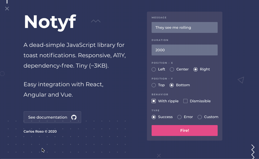
Notyf 是一个用于 Toast 通知的轻量级 JavaScript 库。响应式、A11Y(无障碍) 兼容、无依赖和小巧 (~3KB)。与 React、Angular、Aurelia、Vue 和 Svelte 轻松集成。
特色
- 响应式。
- A11Y(无障碍) 兼容。
- 强类型代码库(TypeScript Typings 可用)。
- 4 种包:ES6、CommonJS、UMD 和 IIFE(用于原生,无框架使用)。
- 使用 Cypress 进行端到端测试。
- 可轻松插入现代框架,可与 React、Angular、Aurelia、Vue 和 Svelte 集成。
- 可选涟漪效果。
- 简单但高度可扩展的 API。可创建你自己的Toast类型并对其进行自定义。
- 支持在 toast 中呈现自定义 HTML 内容。
- 占用空间很小(压缩后小于 3K)。
- 适用于 IE11。
安装
npm i notyf用法
以下是基本用法,要与Angular、React、Aurelia、Vue 或 Svelte集成,请参阅这里。(下文说明文字中出现的 ”Toast“,”通知“实为同一个东西 :))
将 css 和 js 文件添加到你的主文档中:
<html>
  <head>
    ...
    <link rel="stylesheet" href="https://cdn.jsdelivr.net/npm/notyf@3/notyf.min.css">
  </head>
  <body>
    ...
    <script src="https://cdn.jsdelivr.net/npm/notyf@3/notyf.min.js"></script>
  </body>
</html>
基本用法
// 创建 Notyf 的实例
var notyf = new Notyf();

// 显示一个错误通知
notyf.error('You must fill out the form before moving forward');

// 显示一个成功通知
notyf.success('Your changes have been successfully saved!');
使用模块
import { Notyf } from 'notyf';
import 'notyf/notyf.min.css'; // 在 React, Vue 和 Svelte 中使用

// 创建 Notyf 的实例
const notyf = new Notyf();

// 显示一个错误通知
notyf.error('Please fill out the form');
API
你可以在创建 Notyf 实例时进行一些设置。
new Notyf(options: INotyfOptions)
| 参数 | 类型 | 默认值 | 说明 |
| duration | number | 2000 | 隐藏通知前的毫秒数。使用 0 表示无限持续时间。 |
| ripple | boolean | true | 是否显示具有涟漪效果的通知。 |
| position | INotyfPosition | {x:'right',y:'bottom'} | 呈现通知的视口位置。 |
| dismissible | boolean | false | 是否允许用户通过按钮关闭通知。 |
| types | INotyfNotificationOptions[] | Success and error toasts | 每种Toast都有单独配置的阵列。 |
dismiss(notification: NotyfNotification)
关闭特定通知。
const notyf = new Notyf();
const notification = notyf.success('Address updated');
notyf.dismiss(notification);
dismissAll()
关闭所有活动通知。
const notyf = new Notyf();
notyf.success('Address updated');
notyf.error('Please fill out the form');
notyf.dismissAll();
事件
每个单独的通知都可以使用 on 方法进行监听。
'click'
单击通知时触发。
const notyf = new Notyf();
const notification = notyf.success('Address updated. Click here to continue');
notification.on('click', ({target, event}) => {
  // target: the notification being clicked
  // event: the mouseevent
  window.location.href = '/';
});
'dismiss'
当通知被手动(非程序)关闭时触发。
const notyf = new Notyf();
notyf
  .error({
    message: 'There has been an error. Dismiss to retry.',
    dismissible: true
  })
  .on('dismiss', ({target, event}) => foobar.retry());
接口
通知位置
呈现通知的视口位置。
| 参数 | 类型 | 说明 |
| x | left | center | right | x轴定位 |
| y | top | center | bottom | y轴定位 |
通知选项
每个 Toast 的配置项。
| 参数 | 类型 | 说明 |
| type | string | 应用此配置的通知类型 |
| className | string | 在 toast 包装元素中设置的自定义类名 |
| duration | number | 2000 |
| icon | string INotyfIcon false | 要渲染的图标对象。’false’ 隐藏图标。 |
| background | string | toast 的背景颜色 |
| message | string | 要在 toast 中呈现的消息。在全局配置中使用时成为默认消息。 |
| ripple | boolean | 是否在通知出现时渲染涟漪效果 |
| dismissible | boolean | 是否允许用户通过按钮关闭通知 |
通知图标
图标配置。
| 参数 | 类型 | 说明 |
| className | string | 要在图标元素中设置的自定义类名 |
| tagName | string | 用于呈现图标的 HTML5 标记 |
| text | string | 图标内呈现的内部文本 |
| color | string | 图标颜色,必须是有效的 CSS 颜色值,默认为背景颜色。 |
示例
全局配置
- 1s 持续时间
- 在右上角呈现通知
- 带有材料图标的名为“警告”的新自定义通知
- 带有自定义持续时间、颜色和关闭按钮的错误通知
const notyf = new Notyf({
  duration: 1000,
  position: {
    x: 'right',
    y: 'top',
  },
  types: [
    {
      type: 'warning',
      background: 'orange',
      icon: {
        className: 'material-icons',
        tagName: 'i',
        text: 'warning'
      }
    },
    {
      type: 'error',
      background: 'indianred',
      duration: 2000,
      dismissible: true
    }
  ]
});
自定义 toast 类型
注册一个新的 toast 类型并通过引用它的类型名称来使用它:
const notyf = new Notyf({
  types: [
    {
      type: 'info',
      background: 'blue',
      icon: false
    }
  ]
});

notyf.open({
  type: 'info',
  message: 'Send us <b>an email</b> to get support'
});
自定义配置的默认类型
默认类型是“成功”和“错误”。
const notyf = new Notyf();

notyf.error({
  message: 'Accept the terms before moving forward',
  duration: 9000,
  icon: false
})
Notyf 在所有现代框架中都得到了很好的支持,例如 Angular、React、Aurelia、Vue 或 Svelte。 查看此链接了解如何将库集成到你的应用程序中。
2021-06-28